CACHE Climate Health Resource Hub
CLIENT
Carolina Advocates for Climate Health and Equity (CACHE)
TIMELINE
December 2024 - April 2025
ROLE
UI/UX Designer and Research Support on a team of 6
WHAT I DID
Synthesize research findings, create sketches, user personas, mid-hi fidelity wireframes and mockups
Summary of case study
We designed a mobile app to streamline Kappa Theta Pi's (KTP) annual rush process—the recruitment period for new members. The previous system was fragmented and time-consuming, so we conducted user interviews to identify pain points and designed an app entirely dedicated to easing those pain points. We conducted usability testing on low-hi fidelity wireframes and received continuous user feedback. The final product delivered measurable results: 30% reduction in task completion time, 45% increase in user satisfaction, and 100% task-completion rate within the app.


Background on the project
Climate change is increasingly recognized as a public health issue, yet healthcare professionals often struggle to locate trustworthy, actionable resources. Our team partnered with Carolina Advocates for Climate Health and Equity (CACHE) to evaluate their existing website and recommend improvements that would make climate and health information easier to discover, understand, and apply.
As a UX Researcher, my responsibility was to uncover user needs and communicate them in a way that designers could immediately act upon. Through interviews, usability testing, affinity mapping, and research synthesis, I translated qualitative findings into clear, prioritized recommendations.
Those recommendations became the foundation for the design team's website redesign, ensuring that interface decisions were rooted in evidence gathered from real users.
THE QUESTION
How do we make the KTP rush process more seamless?
To narrow the scope of our question we conducted casual in-person interviews with 5 KTP members and KTP rushees here are some of the insights from those interviews.
KTP MEMBERS SAID:

KTP RUSHEES SAID:

We had a team brainstorming session where we thought about ways to measure the success of the project. Using the information we gathered from our initial user interviews we came up with 3 key goals of the app.
REDUCE TASK COMPLETION TIME
Reduce time taken for users to complete rush tasks compared to the initial process.
INCREASE USER SATISFACTION
Create an intuitive user experience with an app that is easy to navigate.
BE A ONE-STOP-SHOP FOR KTP RUSH
Create a system where all user tasks can be completed via the app
Feature Exploration
We started by creating user personas. We already had a lot of background information on our stakeholder needs and on the rush process, but outlining them in a persona made it easier to keep our users in focus. We also started to contextualize that our users were in two main groups "The Member Group" and the "Rushee Group" and both had entirely different, though interlinked, goals for using the app. Examples of our user personas are outlined in the gallery below.
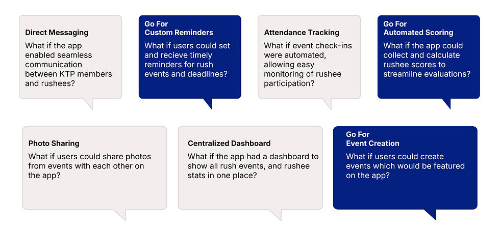
Next, we began outlining a set of potential app features as what I now retrospectively refer to as "what if" scenarios. These "what if" scenarios were a way for us to think creatively and explore different, sometimes even far-fetched, app functionalities. We used these what if scenarios to guide our low-fi sketches of the app. Some examples of these what if scenarios and sketches are outlined in the gallery below.


Research and Key Findings
Since this project had a short timeline (2 months) we iterated quickly without much time for long usability testing phases. As a result, we tried to keep our KTP stakeholders in the loop as much as possible to make sure we remained aligned with user needs. We conducted another round of casual interviews with 8 KTP members and rushees to share our low-fi sketches and what if scenarios with users so we could make any adjustments before working on mid-fidelity wireframes.
We found that although users appreciated advanced features like photo sharing and a centralized dashboard, users prioritized speed and simplicity over advanced features. Some of the feedback we received on features highlighted in our "what if" scenarios and low-fi sketches were:
"I just want to get things done quickly without thinking about where to click"
"I usually just send photos to my friends"
"Making events on the app would be cool"
Research and Key Findings
After reviewing the mid-fidelity wireframes, our users provided valuable feedback, shaping the next iteration of the app.
After reviewing the mid-fidelity wireframes, our users provided valuable feedback, shaping the next iteration of the app.

Feedback on Mid-Fi Wireframes
User testing helped us identify several opportunities to improve the experience before launch. Participants found the navigation and Events page easy to use, and their feedback led to a number of refinements, including simplifying profile pages, adding support for private and public rushee notes, and exploring visual updates such as rounded buttons and a darker color palette.
One of the most interesting findings came when multiple users asked for an "Application" button in the navigation bar. Since the platform was built specifically to help KTP rushees apply, our team had become so familiar with the product that we overlooked adding direct access to one of its core features. It was a valuable reminder that user testing often uncovers gaps that seem obvious in hindsight and reinforced the importance of validating design decisions with real users.

MEMBER VIEW

RUSHEE VIEW
We had a team brainstorming session where we thought about ways to measure the success of the project. Using the information we gathered from our initial user interviews we came up with 3 key goals of the app.
REDUCE TASK COMPLETION TIME
Reduce time taken for users to complete rush tasks compared to the initial process.
30%
Time saved compared to initial test.
INCREASE USER SATISFACTION
Create an intuitive user experience with an app that is easy to navigate.
45%
Time saved compared to initial test.
BE A ONE-STOP-SHOP FOR KTP RUSH
Create a system where all user tasks can be completed via the app.
100%
Time saved compared to initial test.
Outcomes
WHAT I LEARNED
One of the most interesting findings came when multiple users asked for an "Application" button in the navigation bar. Since the platform was built specifically to help KTP rushees apply, our team had become so familiar with the product that we overlooked adding direct access to one of its core features. It was a valuable reminder that user testing often uncovers gaps that seem obvious in hindsight and reinforced the importance of validating design decisions with real users.
WHAT I WOULD'VE DONE DIFFERENTLY
One of the most interesting findings came when multiple users asked for an "Application" button in the navigation bar. Since the platform was built specifically to help KTP rushees apply, our team had become so familiar with the product that we overlooked adding direct access to one of its core features. It was a valuable reminder that user testing often uncovers gaps that seem obvious in hindsight and reinforced the importance of validating design decisions with real users.