
Summary of case study
We designed a mobile app to streamline Kappa Theta Pi's (KTP) annual rush process—the recruitment period for new members. The previous system was fragmented and time-consuming, so we conducted user interviews to identify pain points and designed an app entirely dedicated to easing those pain points. We conducted usability testing on low-hi fidelity wireframes and received continuous user feedback. The final product delivered measurable results: 30% reduction in task completion time, 45% increase in user satisfaction, and 100% task-completion rate within the app.


Background on the project
Kappa Theta Pi (KTP) is a professional technology fraternity at UNC Chapel Hill dedicated to building a vibrant community of tech-interested students. They offer technical advancement, professional development, career readiness, and networking opportunities for members.
Every year KTP has a "rush" process for students to join the organization. During this process valuable data is collected from prospective members (rushees) to assess their fit with the organization and rushees are scored by KTP members. However, the previous rush system created significant challenges for everyone involved.
Some of these challenges (discovered during our casual interviews) are: Data Fragmentation due to the use of separate google forms and spreadsheets to track rushee information, time-consuming manual evaluation of rushee scores since there was no way to automatically calculate the scores they were given, and general uncertainty with rushees as they often did not receive submission confirmation and updates.
THE DESIGN CHALLENGE
How do we make create a centralized experience that makes KTP's recruitment process faster, simpler and easier to manage for everyone involved?
To narrow the scope of our challenge we conducted casual in-person interviews with current KTP members and prospective members (rushees). Here are some of the insights from those interviews.
KTP MEMBERS SAID:

KTP RUSHEES SAID:

Before designing any screens, our team brainstorming session where we thought about ways to measure the success of the project. Using the information we gathered from our initial user interviews we came up with 3 key goals of the app.
REDUCE TASK COMPLETION TIME
Reduce time taken for users to complete rush tasks compared to the initial process.
INCREASE USER SATISFACTION
Create an intuitive user experience with an app that is easy to navigate.
BE A ONE-STOP-SHOP FOR KTP RUSH
Create a system where all user tasks can be completed via the app
Feature Exploration
We started by creating user personas. We already had a lot of background information on our stakeholder needs and on the rush process, but outlining them in a persona made it easier to keep our users in focus. We also started to contextualize that our users were in two main groups "The Member Group" and the "Rushee Group" and both had entirely different, though interlinked, goals for using the app. Examples of our user personas are outlined in the gallery below.
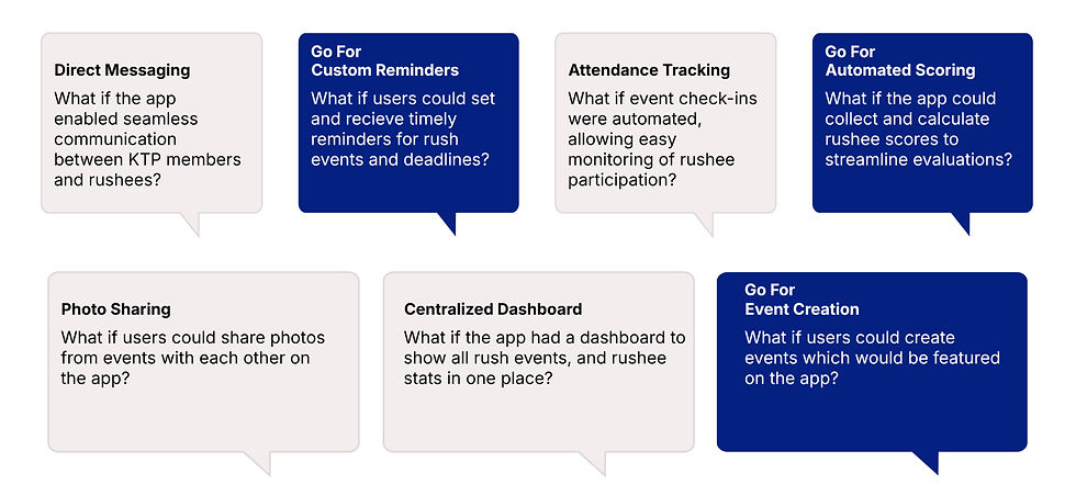
Next, we began outlining a set of potential app features as what I now retrospectively refer to as "what if" scenarios. These "what if" scenarios were a way for us to think creatively and explore different, sometimes even far-fetched, app functionalities. We used these what if scenarios to guide our low-fi sketches of the app. Some examples of these what if scenarios and sketches are outlined in the gallery below.


Research and Key Findings
Since this project had a short timeline (2 months) we iterated quickly without much time for long usability testing phases. As a result, we tried to keep our KTP stakeholders in the loop as much as possible to make sure we remained aligned with user needs. We conducted another round of casual interviews with KTP members and rushees to share our low-fi sketches and what if scenarios with users so we could make any adjustments before working on mid-fidelity wireframes.
We found that although users appreciated advanced features like photo sharing and a centralized dashboard, users prioritized speed and simplicity over advanced features. Some of the feedback we received on features highlighted in our "what if" scenarios and low-fi sketches were:
"I just want to get things done quickly without thinking about where to click"
"I usually just send photos to my friends"
"Making events on the app would be cool"
Mid-Fi Wireframing
After incorporating early feedback, we designed interactive mid-fidelity wireframes focused on simpler navigation, faster workflows, clear information hierarchy, and reduced user effort.
We conducted another round of usability testing with members and rushees using our mid-fidelity prototype. Participants completed common rush tasks while we observed friction points and collected qualitative feedback.

Feedback on Mid-Fi Wireframes
User testing helped us identify several opportunities to improve the experience before launch. Participants found the navigation and Events page easy to use, and their feedback led to a number of refinements, including simplifying profile pages, adding support for private and public rushee notes, and exploring visual updates such as rounded buttons and a darker color palette.
One of the most interesting findings came when multiple users asked for an "Application" button in the navigation bar. Since the platform was built specifically to help KTP rushees apply, our team had become so familiar with the product that we overlooked adding direct access to one of its core features. It was a valuable reminder that user testing often uncovers gaps that seem obvious in hindsight and reinforced the importance of validating design decisions with real users.

MEMBER VIEW

RUSHEE VIEW
Final Solution
The final application centralized every major part of KTPs recruitment process into one experience.
Core functionality included features such as: Application tracking, automated applicant scoring, event creation, reminders, and applicant profiles. Instead of switching between multiple tools, users could complete every major recruitment task within one platform.
We tested our final prototype with KTP stakeholders and found that the redesigned experience achieved measurable imporvements over the previous workflow. We revisited our 3 key goals for the app to see how well our prototype measured up.
REDUCE TASK COMPLETION TIME
Reduce time taken for users to complete rush tasks compared to the initial process.
30%
Time saved compared to initial test.
INCREASE USER SATISFACTION
Create an intuitive user experience with an app that is easy to navigate.
45%
Time saved compared to initial test.
BE A ONE-STOP-SHOP FOR KTP RUSH
Create a system where all user tasks can be completed via the app.
100%
Time saved compared to initial test.
Reflections on the project
This project reinforced that meaningful UX improvements often come from reducing friction rather than adding features.
While our early brainstorming sessions generated numerous ideas, user research consistently showed that simplifying existing workflows created more value than expanding functionality. Prioritizing automation, centralization, and clear information architecture allowed us to deliver an experience that improved efficiency without fundamentally changing how KTP conducts recruitment.
The project also highlighted the importance of iterative usability testing. The discovery that users expected an Application button in the main navigation, despite the application's primary purpose being recruitment, was a reminder that designers can easily develop blind spots after spending too much time with a product. Regular feedback from real users helped us identify these assumptions and refine the interface before finalizing the design.
As a UX researcher and designer, this experience strengthened my ability to translate qualitative insights into practical product decisions while collaborating closely with a multidisciplinary team throughout the design process.